
Elithair Booking Experience
Turning a high-stakes medical booking from a checkout into a conversation.
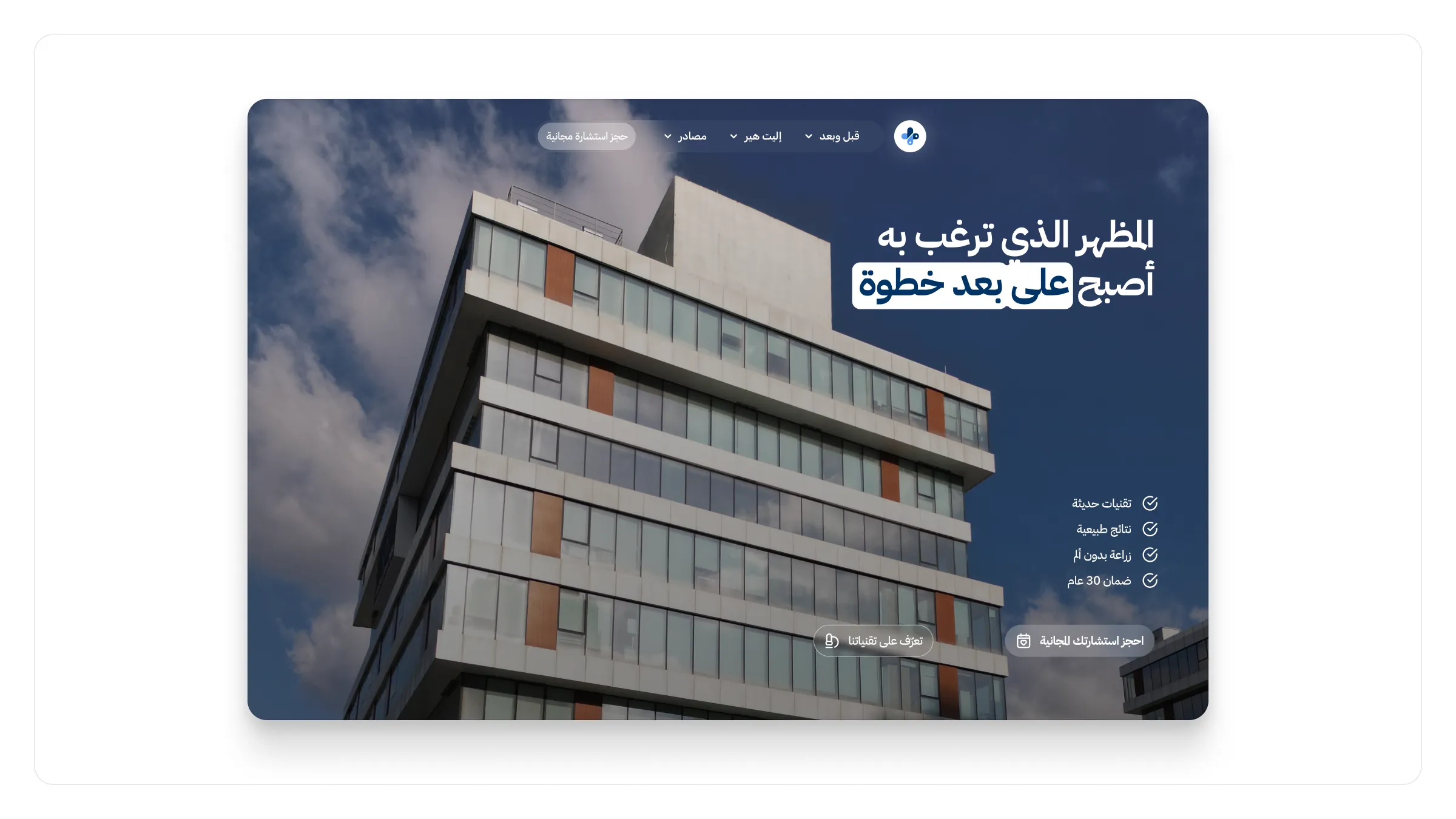
Elithair offers a medical service that involves a real decision, real money, and a real flight — but the booking flow had been treating it like a hotel reservation. Visitors dropped out at the first long form, carrying questions the page never answered, and the flow assumed a certainty most people don't have on a first visit.
I split the flow into smaller steps and moved the questions earlier. Each step now asks one thing, explains why it's asking, and shows what happens next.
It should feel less like a checkout and more like a conversation with a clinic that knows what it's doing.
A calm clinical palette, generous line height, and a quiet progress indicator carry the rest. Completion of the first three steps improved meaningfully, and support saw fewer pre-booking questions because the page answered them in line. The summary screen is what I'd revisit next — it still reads like a receipt rather than a confirmation from a person.