
Awan Cosmetics
Identity and online store for a care brand from Cairo.
- Role
- Brand identity, website design and build
- Platform
- Web, right to left
- Typeface
- Thmanyah
- Status
- Live
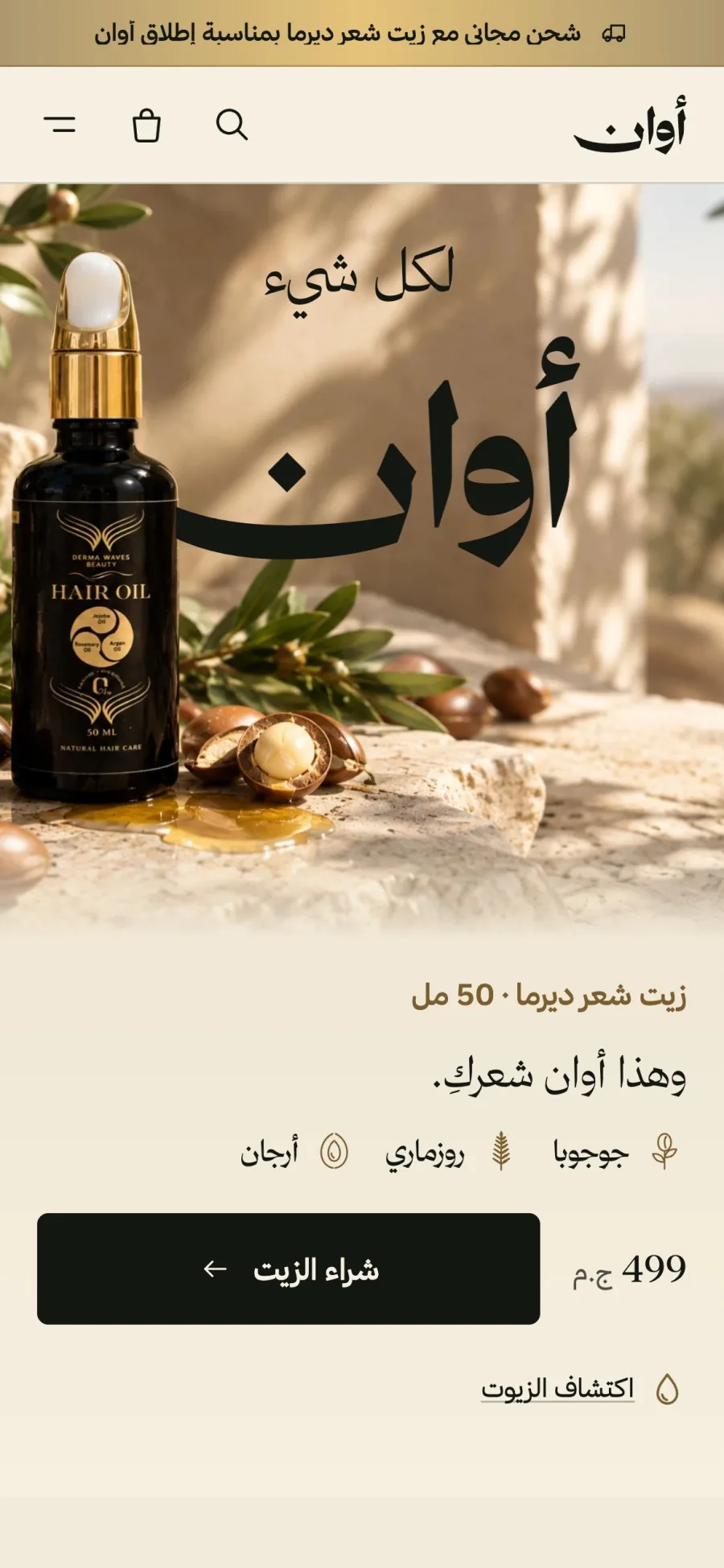
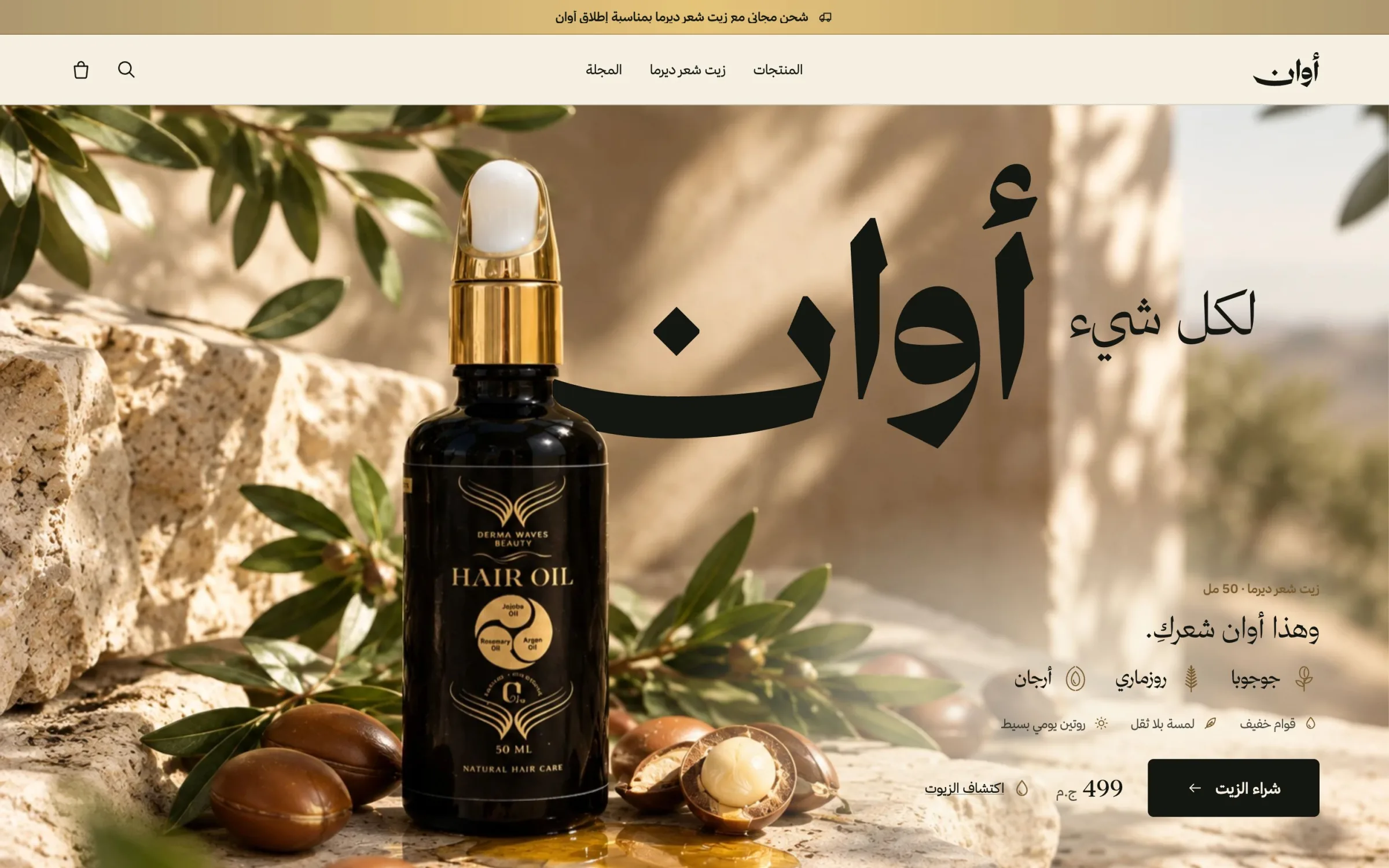
AWAN is a care brand from Cairo. I designed its identity and its online store as one piece, so that the brand is not a logo placed on a template but the way every page looks, reads and behaves.
Designing the brand
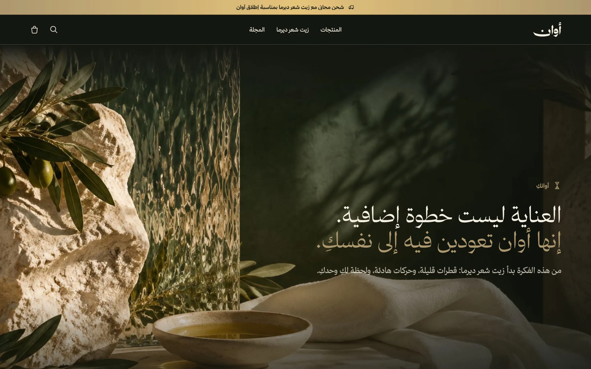
Awan (أوان) means the right time for something, and the brand's line is the saying it comes from: «لكلّ شيءٍ أوان», everything in its time. I used that as the brief for the whole experience. Care is presented as a quiet moment in the day, not an extra step in it, so the site is calm, unhurried and spare with words.
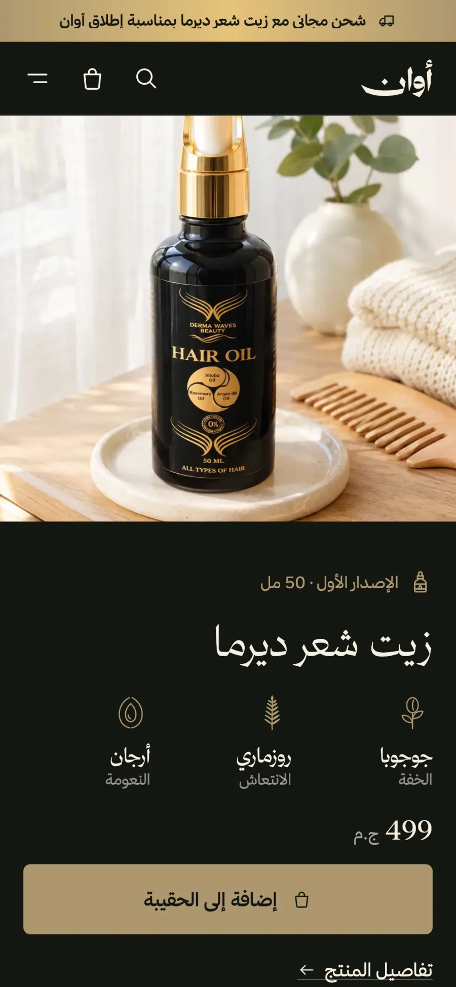
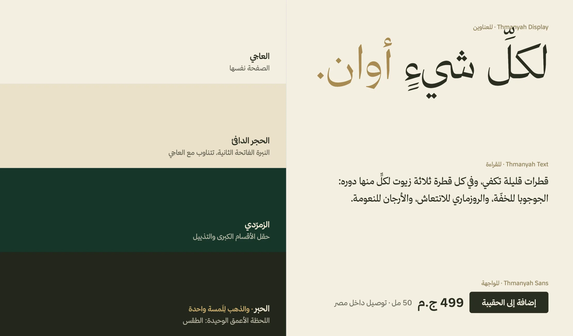
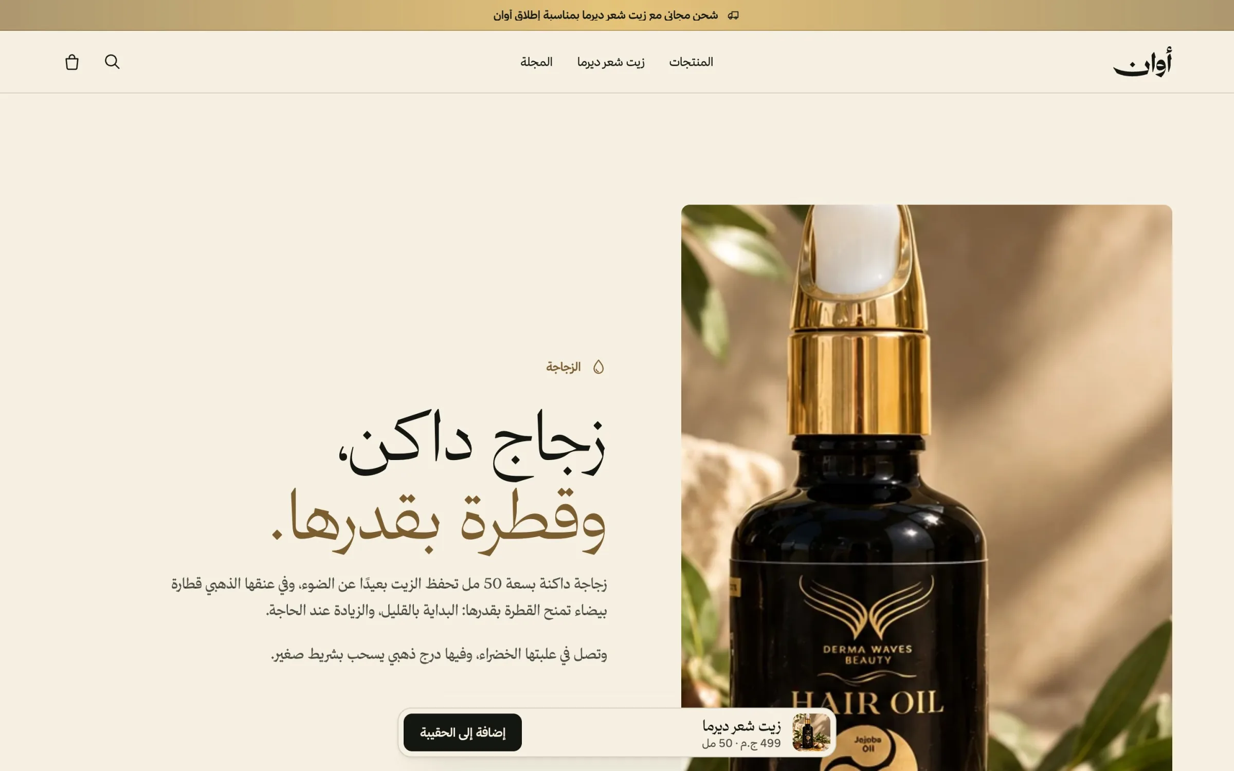
The look comes from the product rather than from a moodboard. Black is the bottle's glass and gold is its foil; emerald holds the large sections and ink is the single deepest note, all on one ivory page. Nothing else is allowed to be a section colour. Thmanyah carries everything in three roles: Display for headlines, Text for reading and Sans for the interface, so Arabic reads as designed type rather than a fallback.
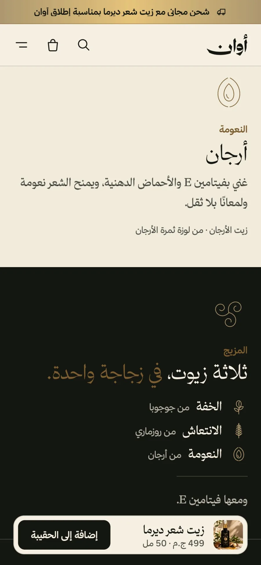
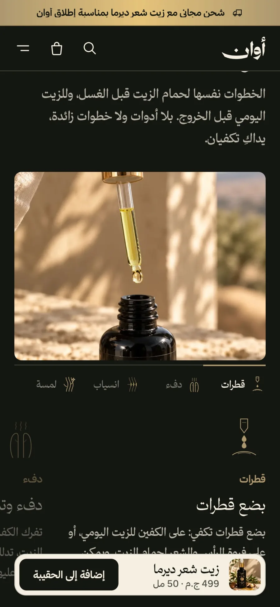
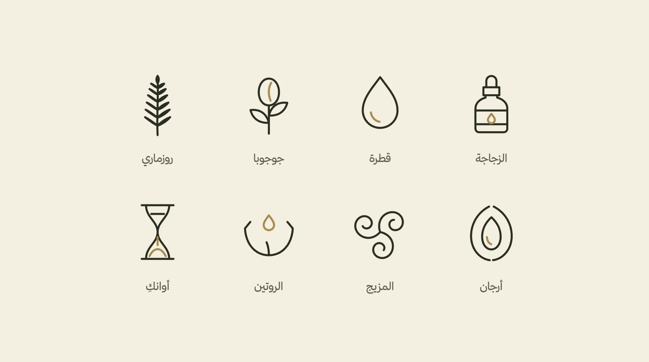
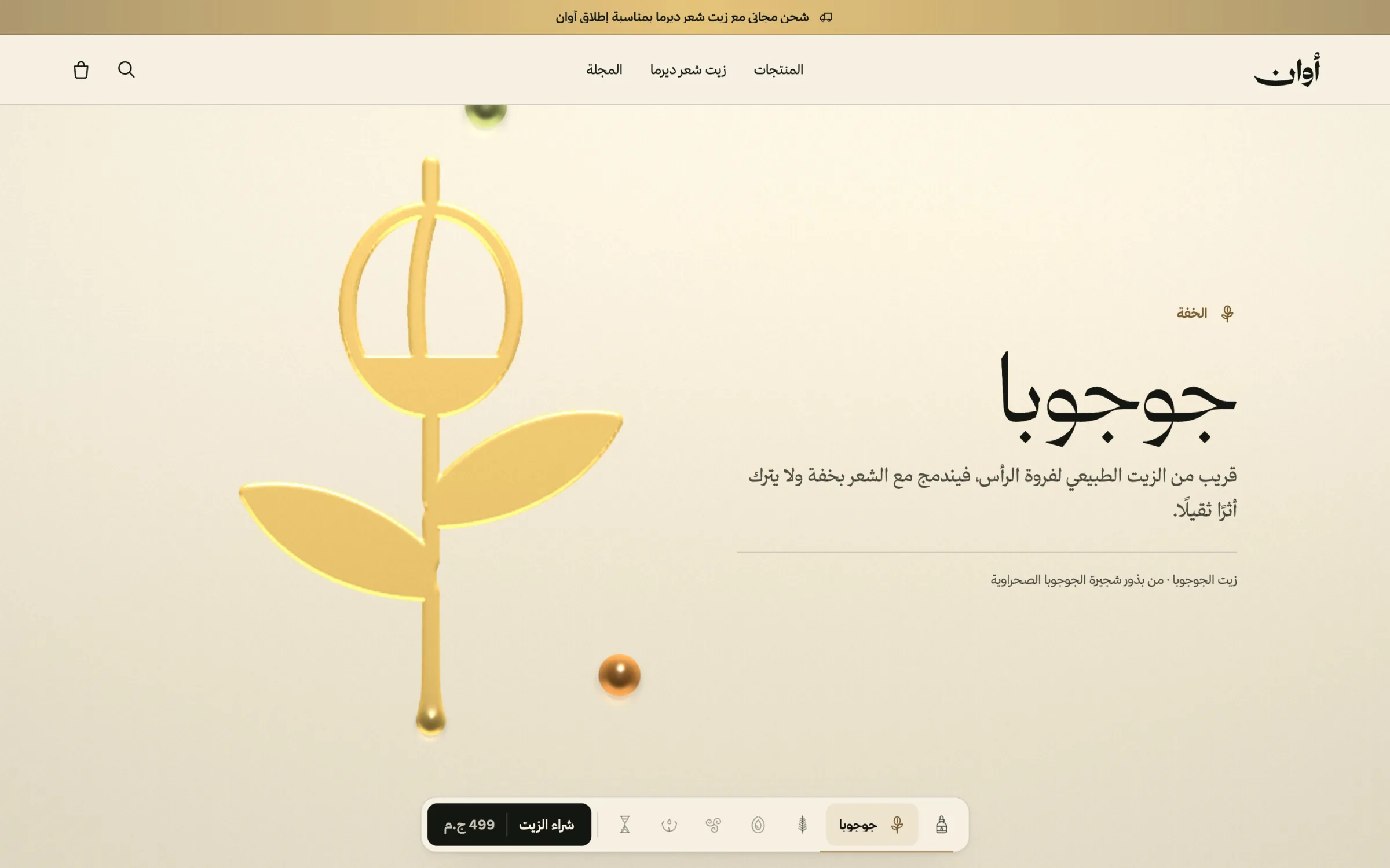
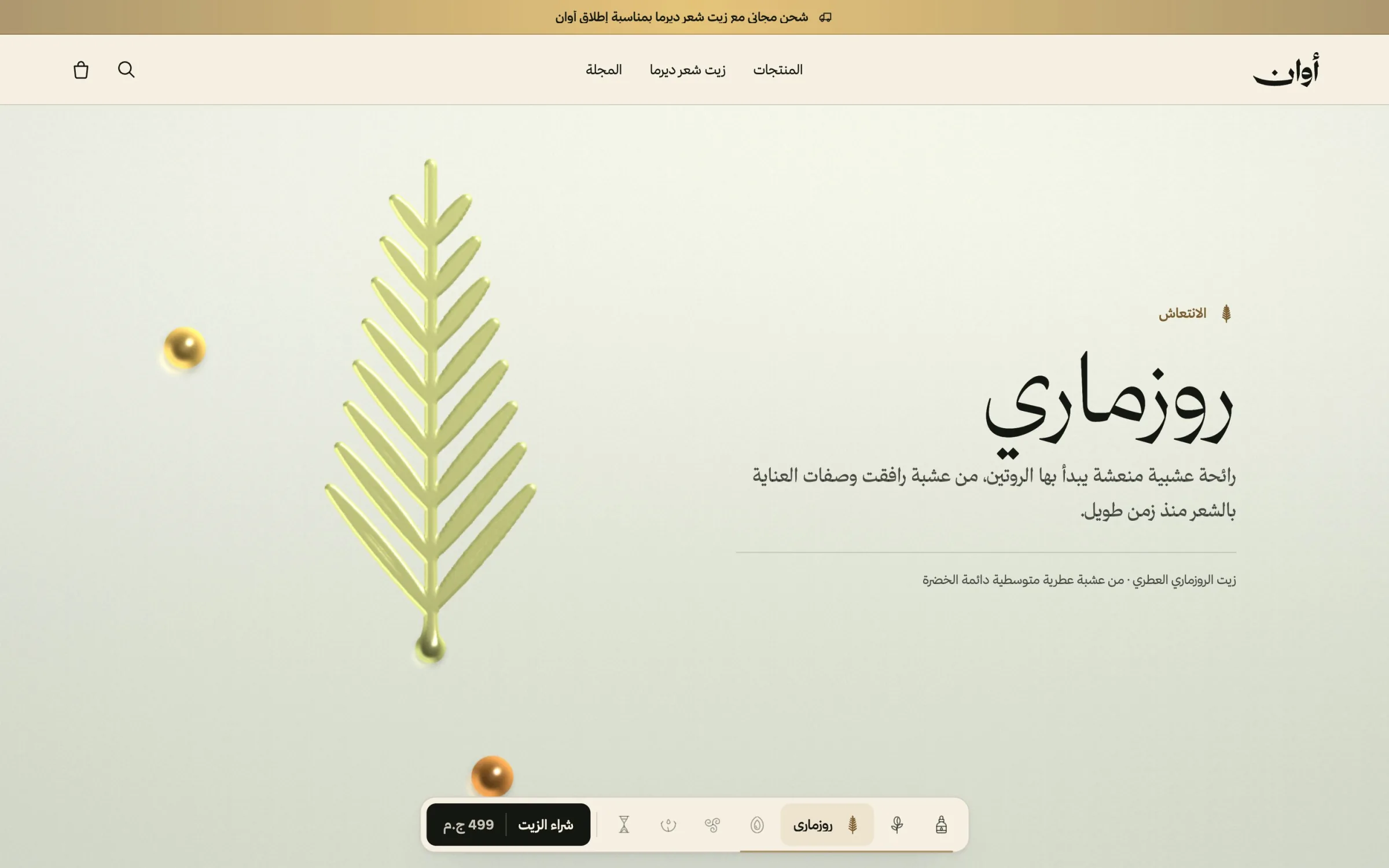
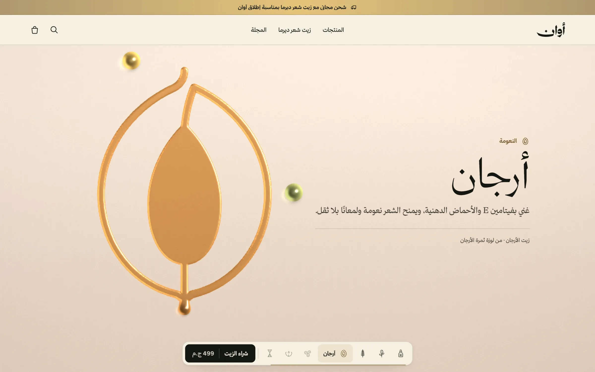
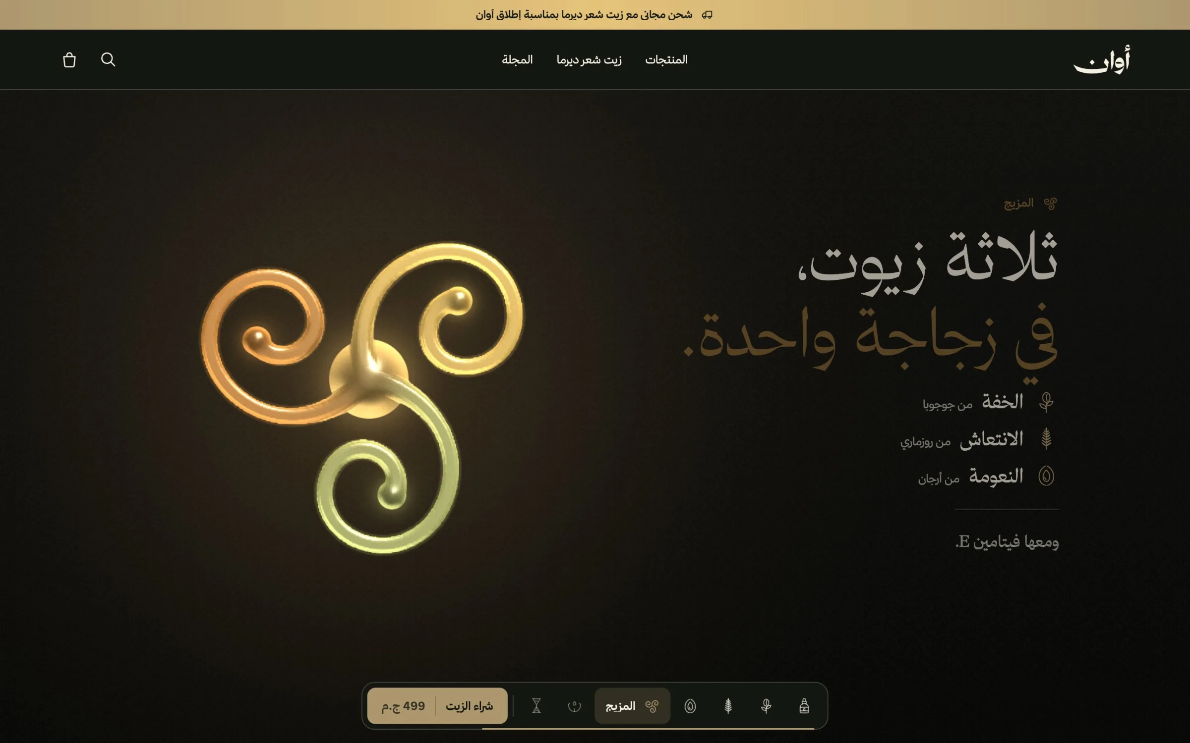
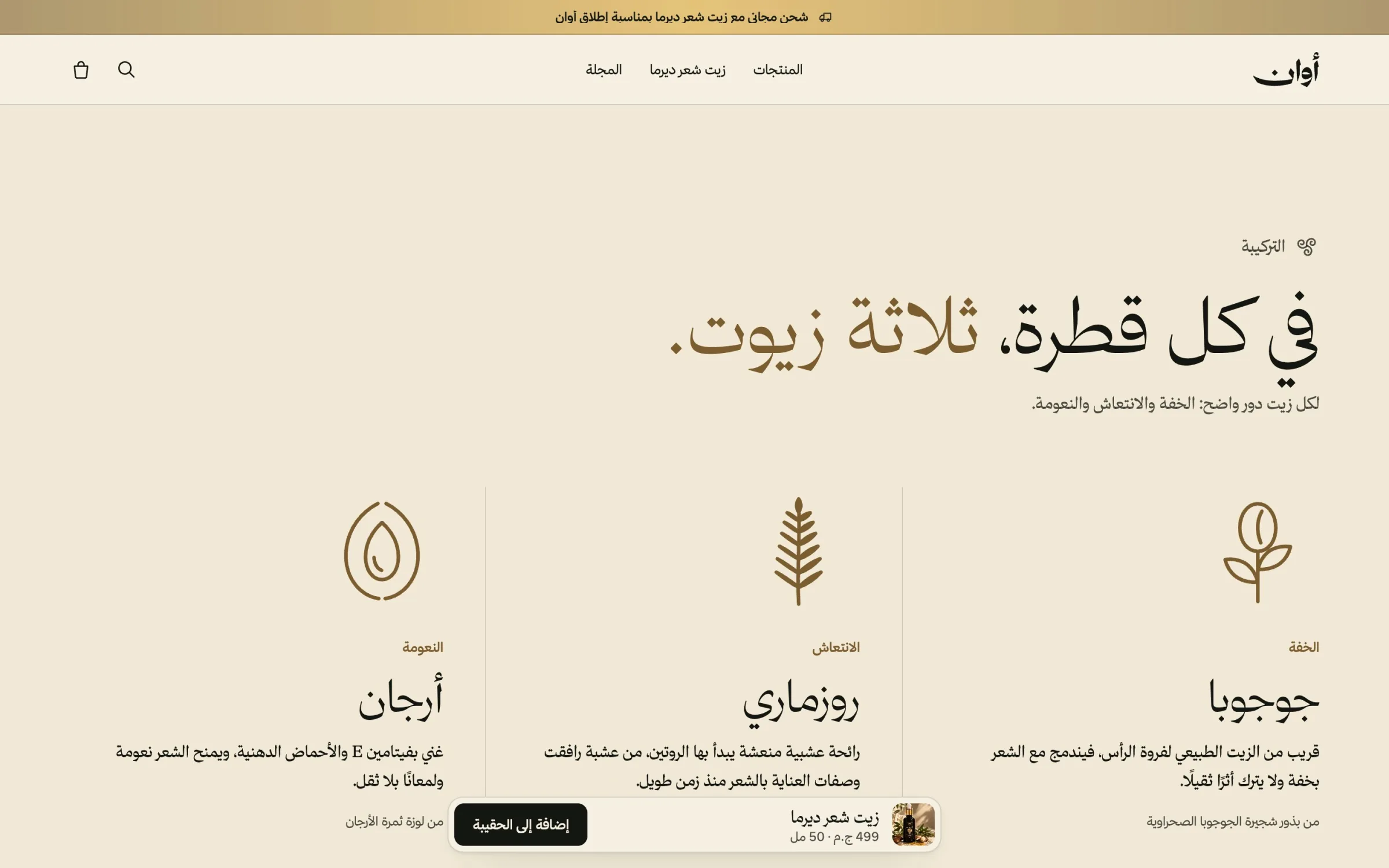
I drew a set of marks from the label itself: the bottle, a drop, each of the three oils, and the blend, redrawn from the three-part emblem on the box. The same marks run the navigation, link to each oil and illustrate each step of the routine, so the identity does real work inside the interface.

One idea, told by scrolling
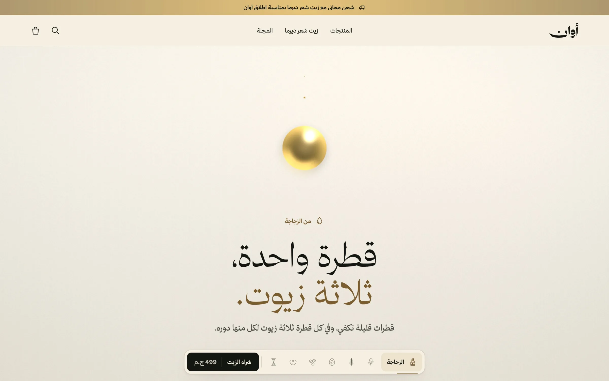
A product with three oils is easy to describe as a list of ingredients and hard to remember. I turned it into one idea the homepage tells as you scroll: one drop, three oils. A drop falls and splits into jojoba, rosemary and argan; each gets its own colour, its own plant drawn in gold and one job, lightness, freshness or softness; then the three merge back into the emblem.
Three is a number people hold easily, and giving each oil a single role turns the formula into something a customer can repeat in their own words. The scroll reveals one thing at a time, so the page never asks the reader to take in more than one idea at once.
A routine, not a product
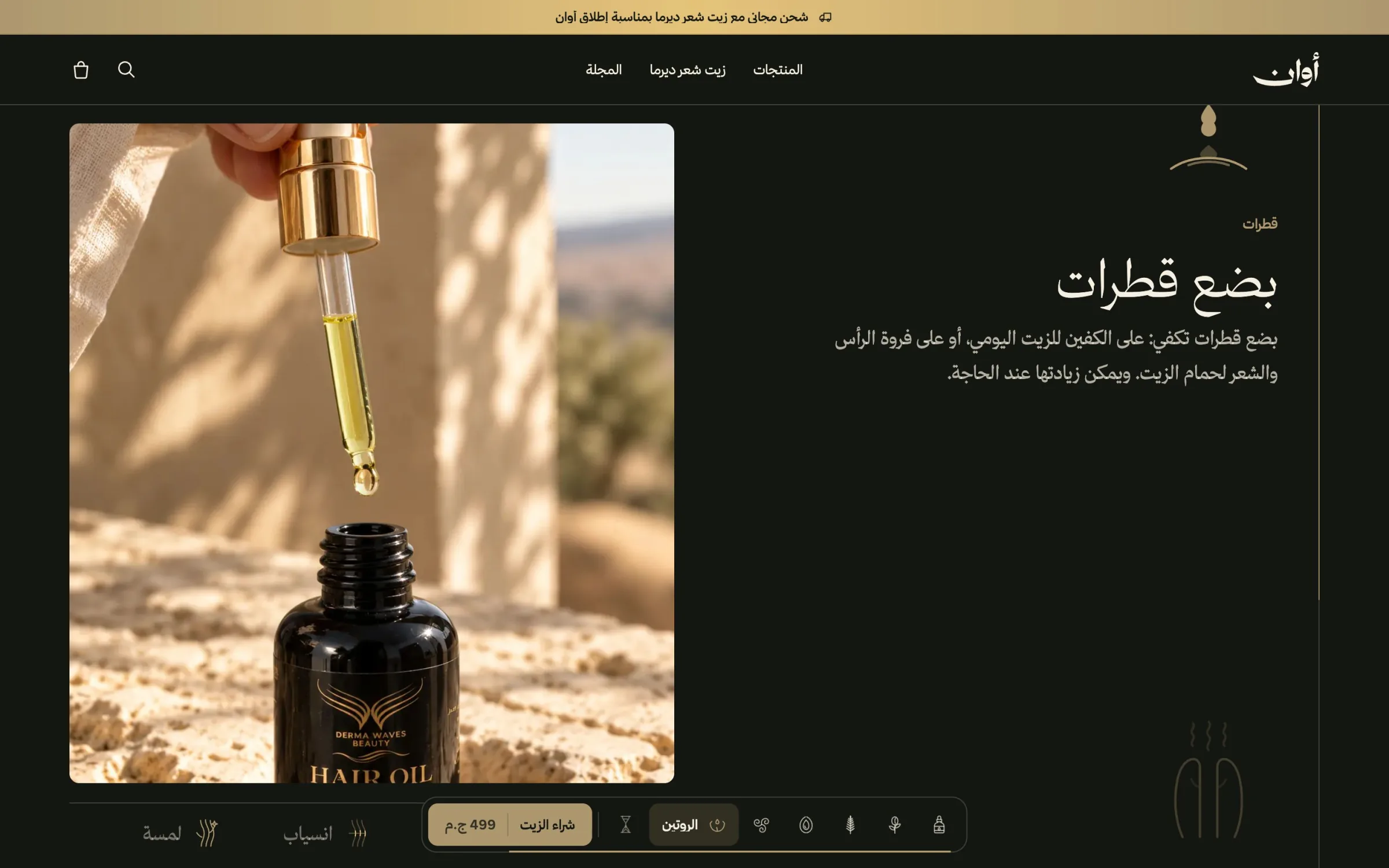
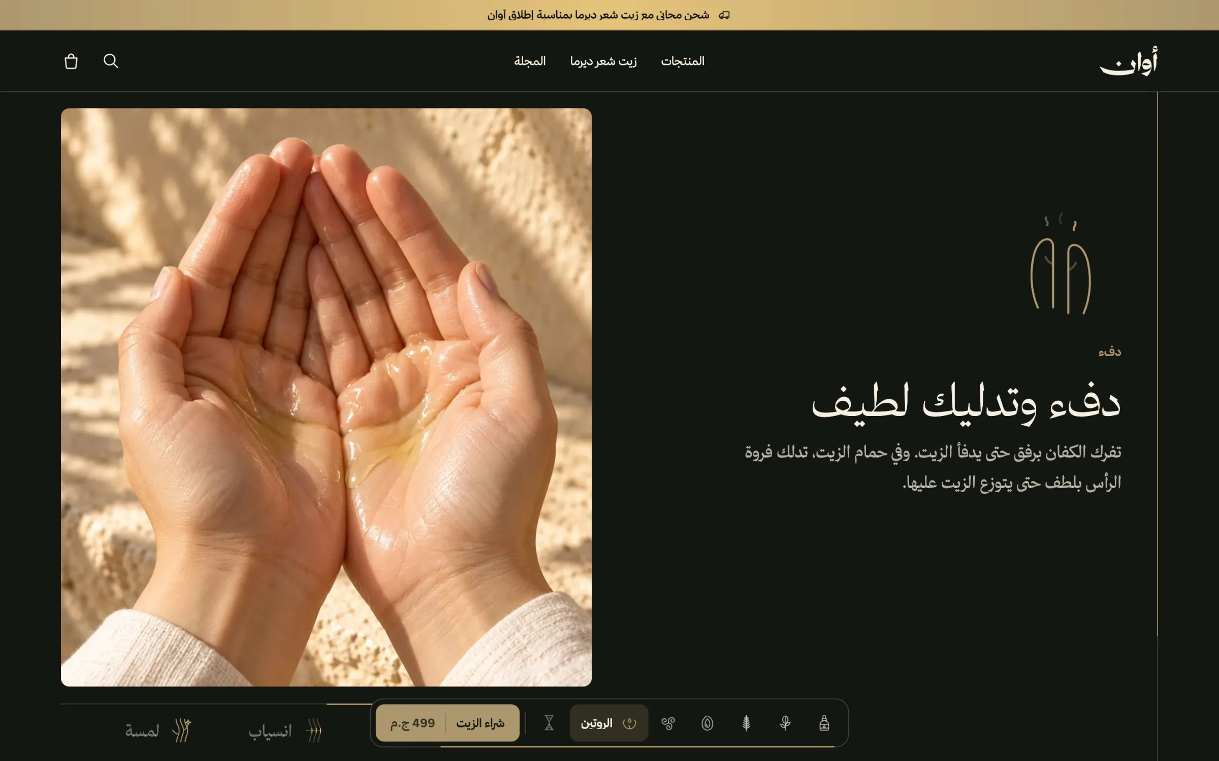
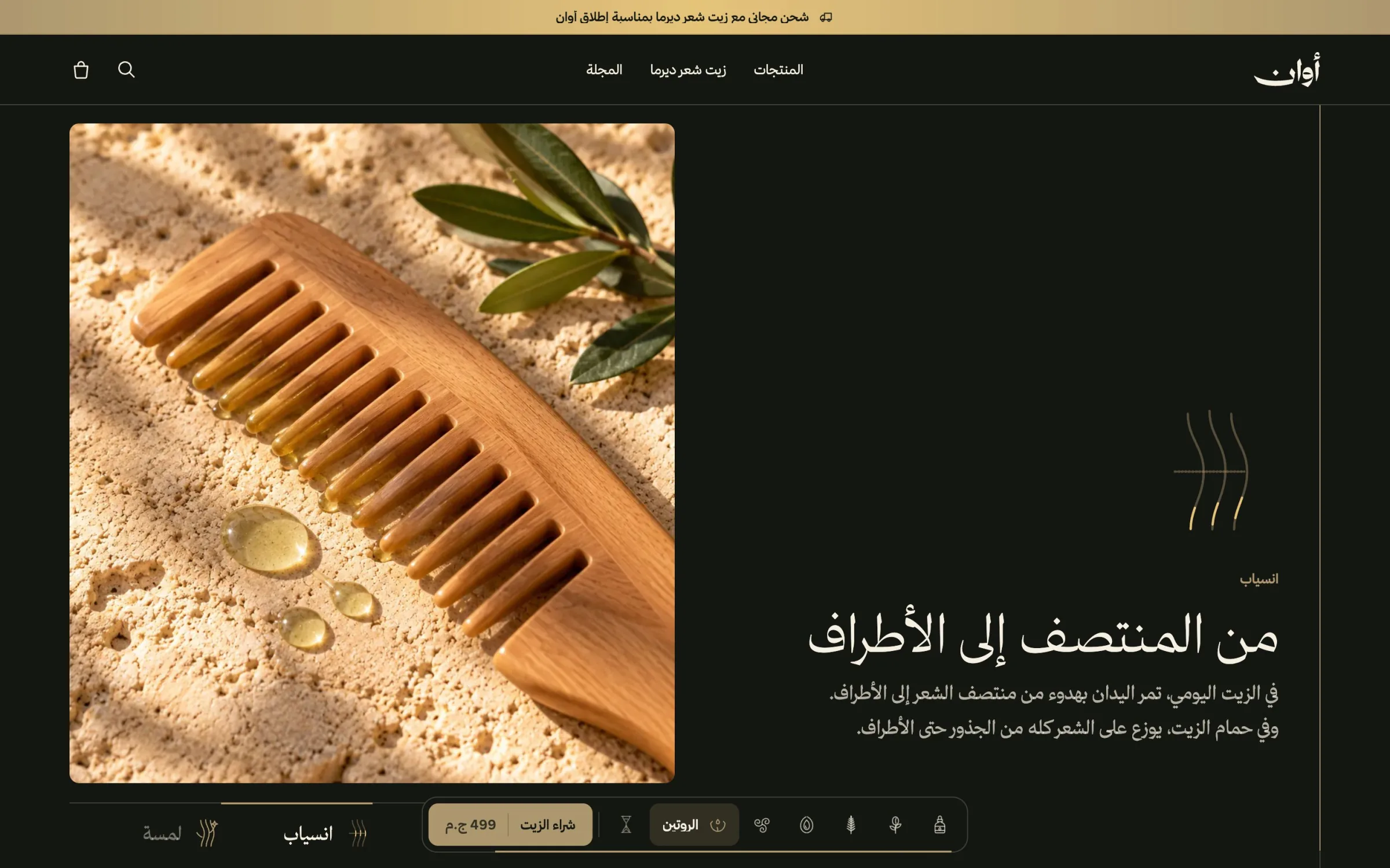
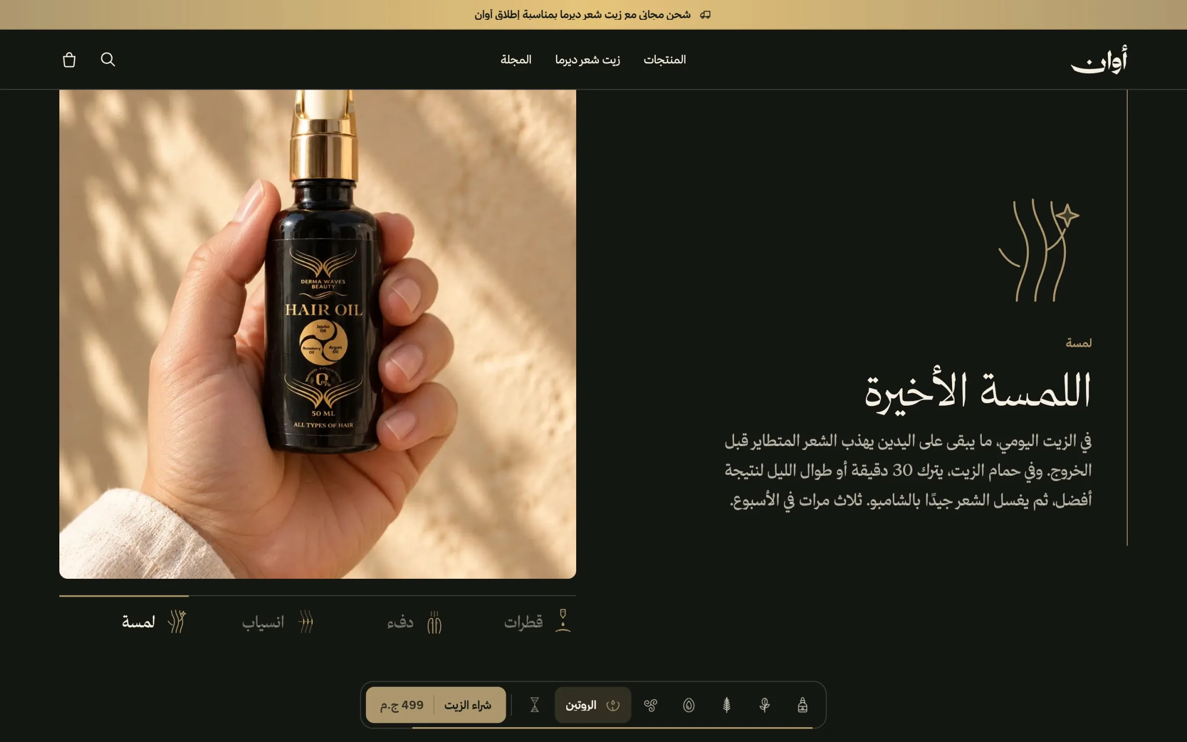
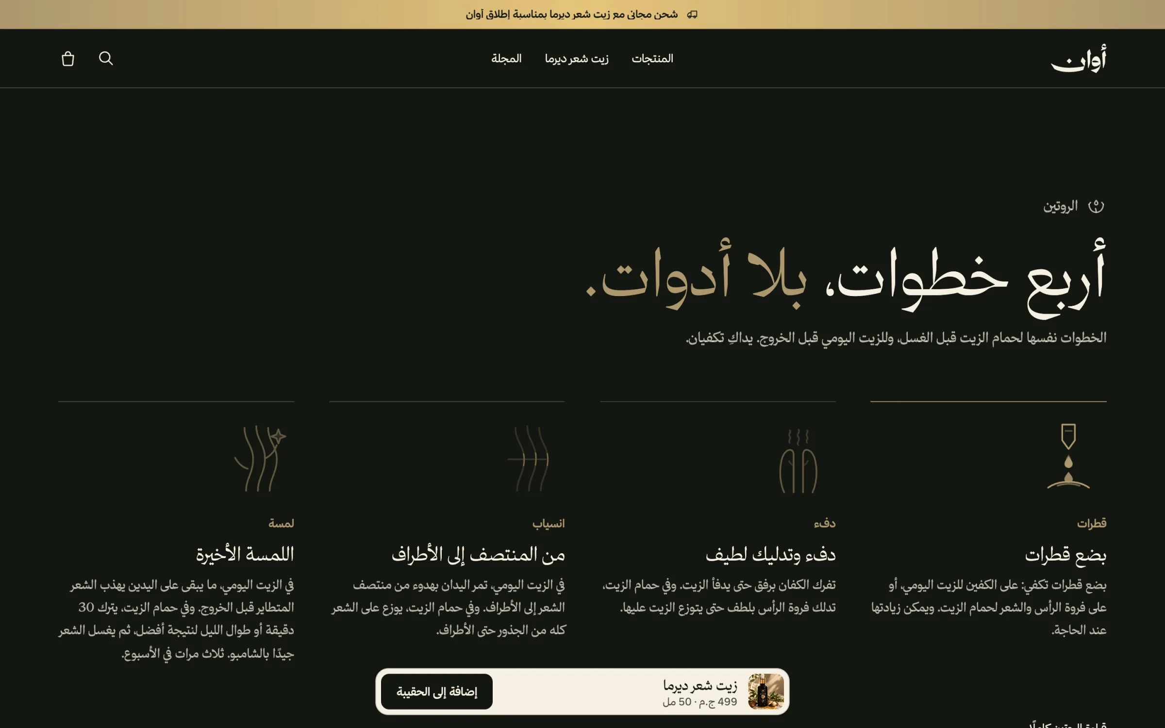
People buy a hair oil for what they will do with it, so the homepage moves from the formula to the routine: four steps on a dark ground, each with its photograph and its mark, from a few drops to the final touch. The change of register from ivory to dark marks the move from what the product is to how it is used.
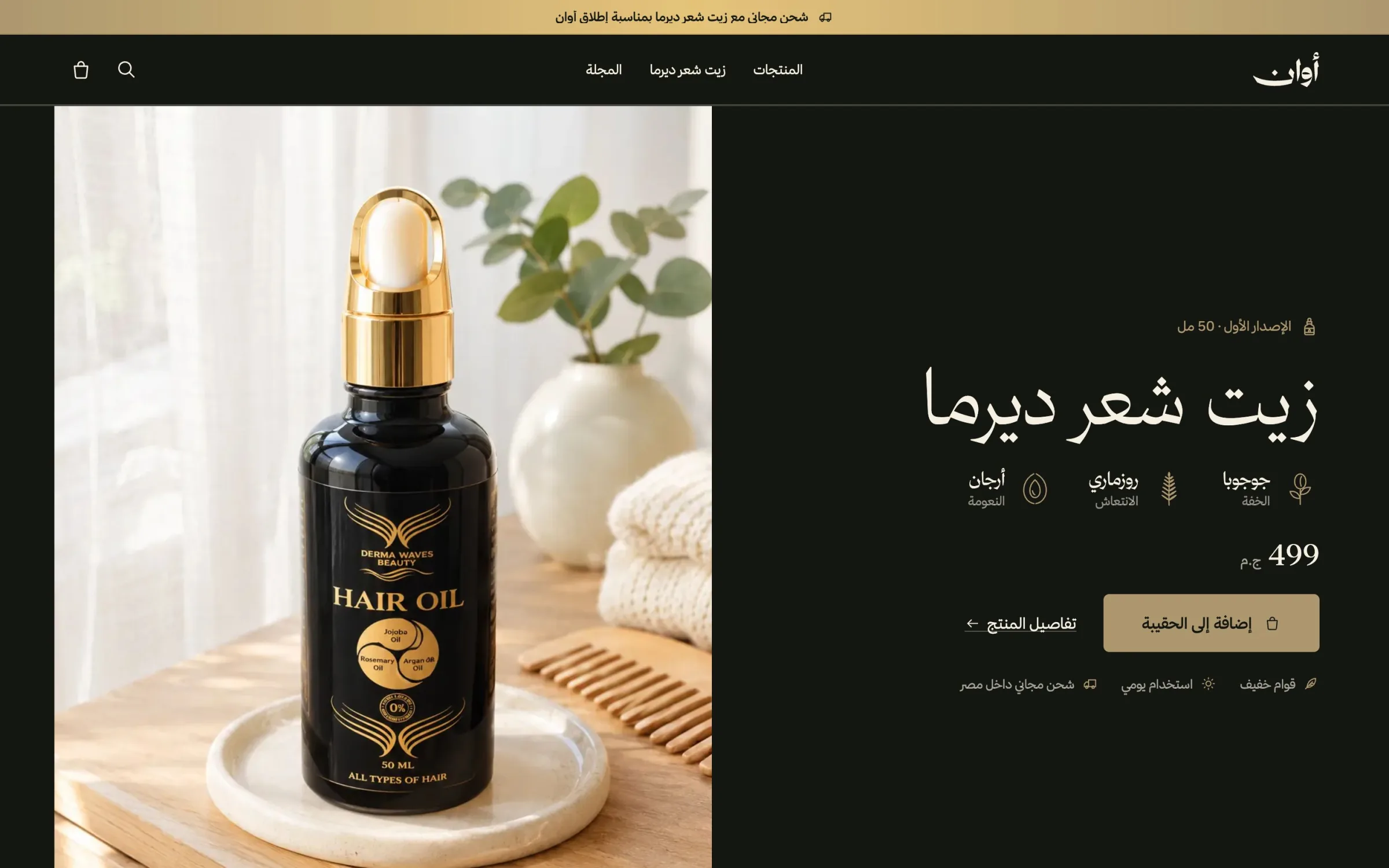
The offer comes only after that, with the bottle, its price and one action, and the page closes on the brand's promise rather than a sales banner.
The store
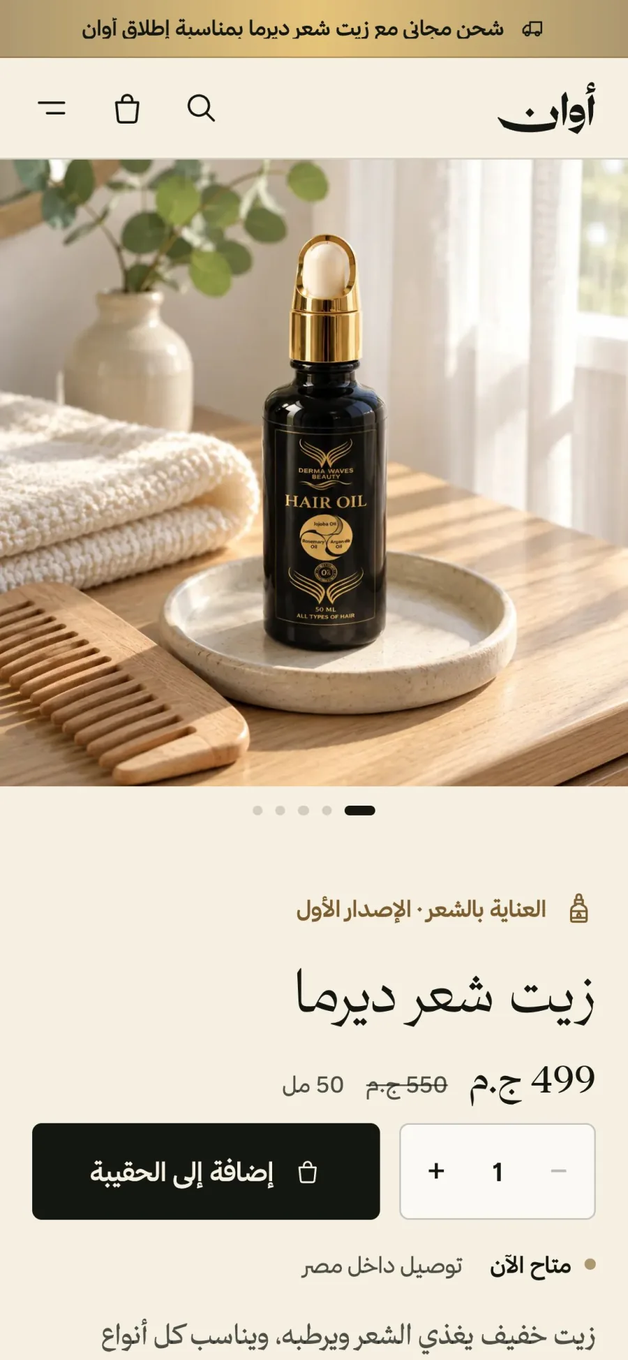
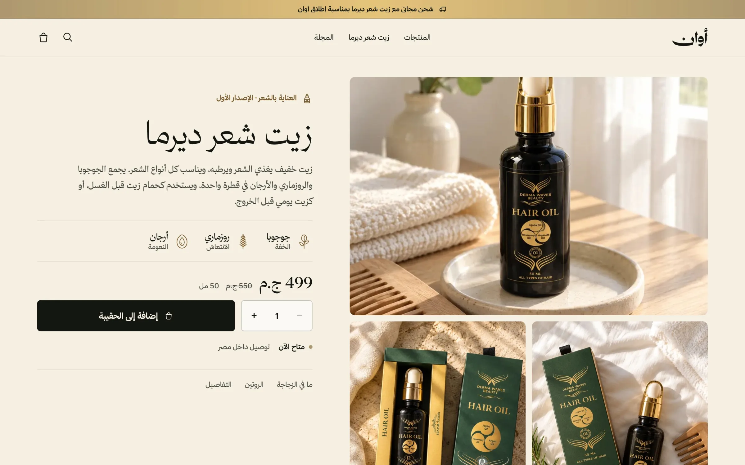
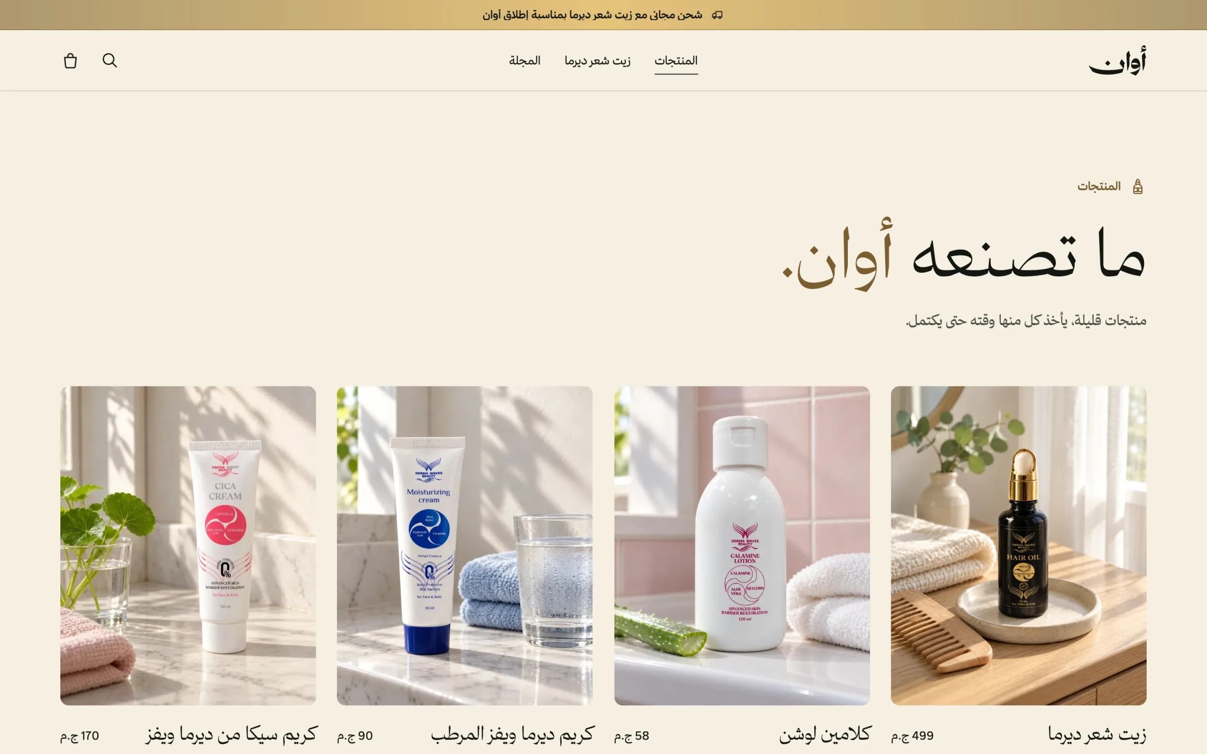
The product page follows the questions a customer asks in order: what is it, why these oils, how do I use it, and the details. The bottle and its box lead, a buy bar stays within reach while you read, and every section repeats the homepage's language so the store feels like the same place.
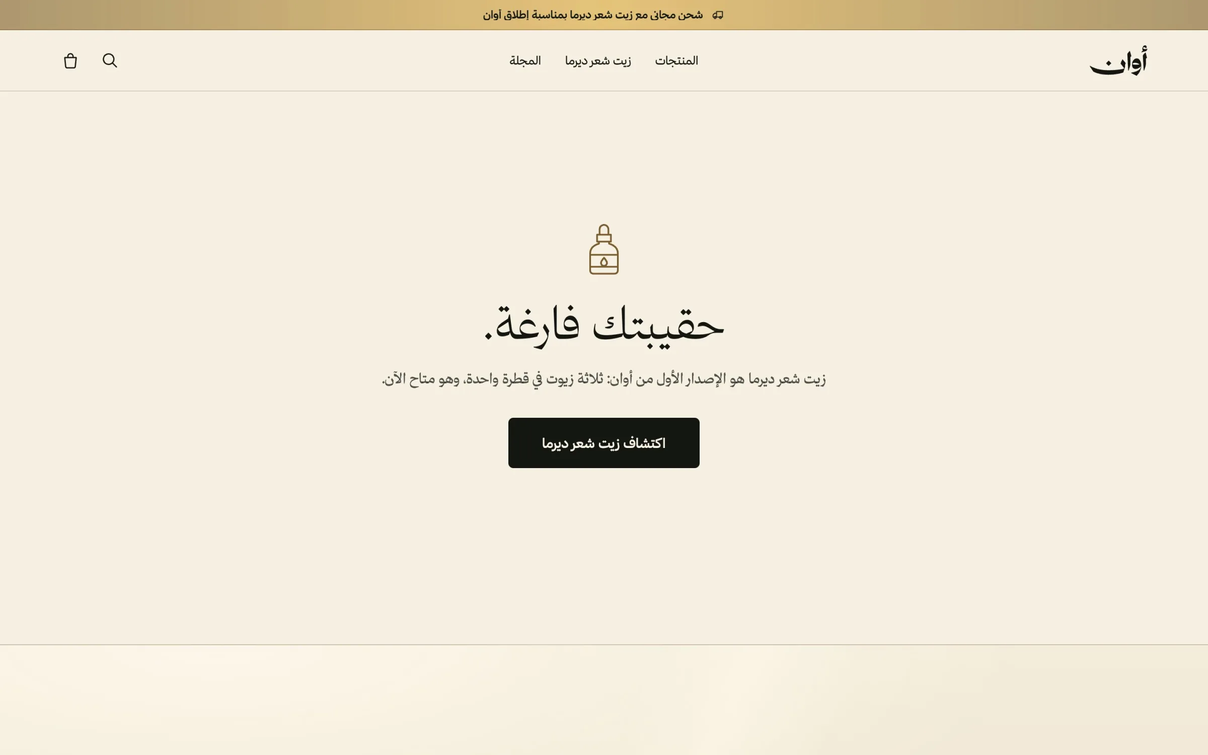
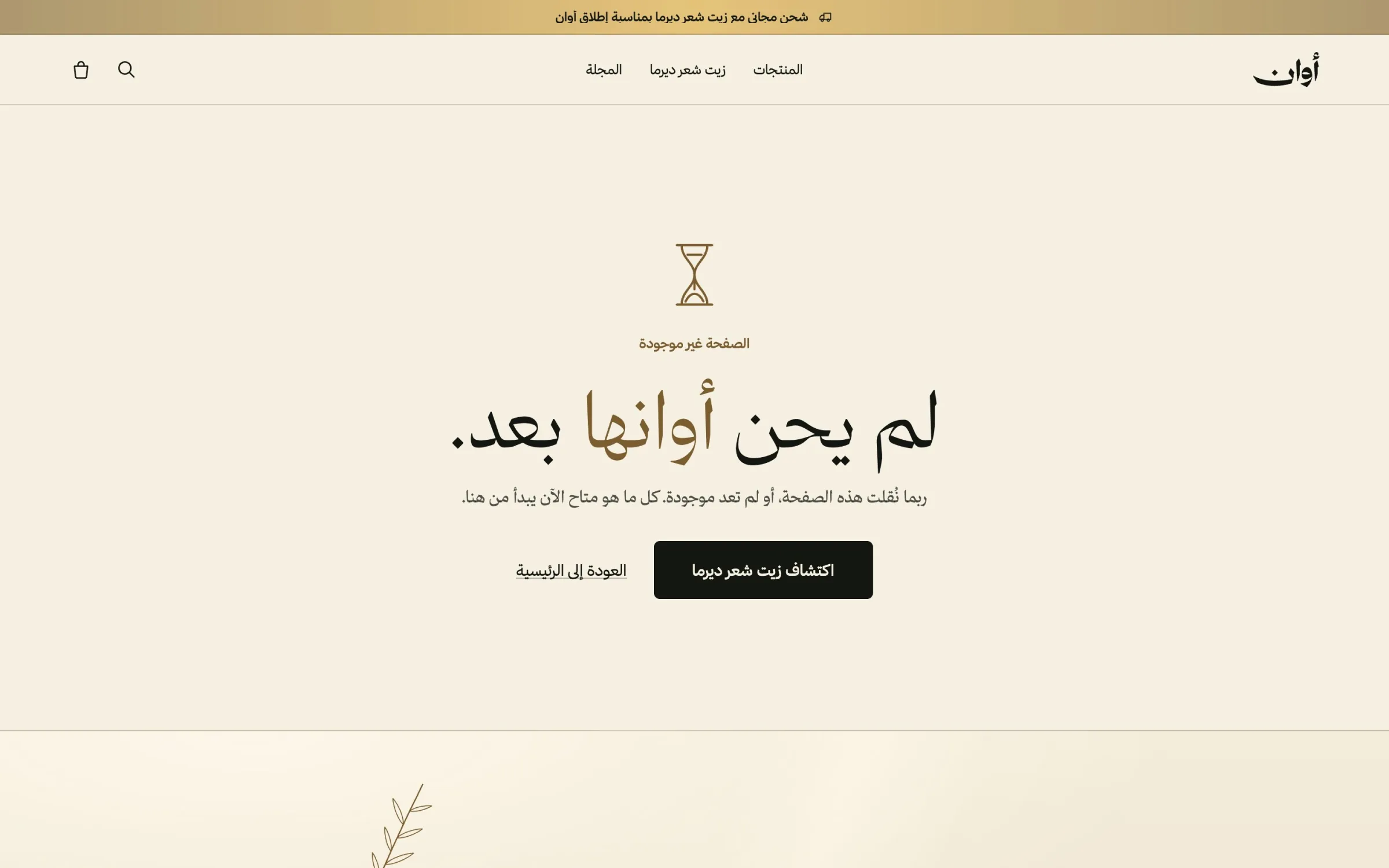
I split the site into two registers. The pages that tell, the product and the story, are editorial. The pages that work, the bag, checkout and account, stay plain and fast, because a checkout is not the place for atmosphere. Even the edges keep the voice: an empty bag invites you back, and a missing page says «لم يحن أوانها بعد», its time hasn't come yet.
Phones as their own design
Most visitors arrive on a phone, so phones are designed, not shrunk. They have their own type scale, tighter spacing between sections, the oils as stacked blocks and the main actions in the lower half of the screen, within reach of the thumb. The buy bar is always one tap away.